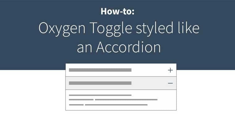
Oxygen Builder Toggle to Accordion
January 26, 2021 - 2 min read
Adding more style to the default Toggle component in Oxygen. A simple and easy way to make your toggle look more like an accordion. Watch the video to see how:
For the css required for this you can find it below:
// This goes on the Toggle Element to style it to look like an accordion
.accordion-style {
	display: block;
	padding: 15px 15px;
	border: 1px solid rgba(0,0,0,0.3);
	width: 100%;
	position: relative;
}

// This positions the icon to the right and in the center vertically
.accordion-style .oxy-expand-collapse-icon {
	position: absolute;
	right: 6px;
	top: 50%;
	transform: translateY(-50%);
}

// This will change the color of the title when it is expanded... this is because Oxygen will add a class ending with expanded to the end of the class, thus we can use `$` as a wildcard
.accordion-style[class$="expanded"] {
	background: #efefef;
}

// This goes on the text element or div that is directly below the toggle element as this will be what is revealed when the toggle is clicked
.accordion-style-content {
	padding: 15px 15px;
	border-left: 1px solid rgba(0,0,0,0.3);
	border-right: 1px solid rgba(0,0,0,0.3);
	border-bottom: 1px solid rgba(0,0,0,0.3);
	width: 100%;
	position: relative;
}