Learn stroke-dasharray and stroke-dashoffset - SVG Asphalt 9 Preloader
If you have ever used SVG you are most likely familiar with stroke-dashoffset and stroke-dasharray. If you have used SVG's before... well... this will be a nice crash course to not only get your feet wet with using SVG's but see how fun and easy it can be to create something cool. Let's cover some of the basics.
Drawing a square with SVG
<svg version="1.1" x="0px" y="0px" viewBox="0 0 200 200" xml:space="preserve">
  <path
      id="square"
      d="M 30 30, 170 30, 170 170, 30 170 Z"
      fill="none"
      stroke-width="6px"
      stroke="#222"/>
</svg>
Result

What is stroke-dasharray?
The stroke-dasharray attribute is a presentation attribute defining the pattern of dashes and gaps used to paint the outline of the shape.
Note: As a presentation attribute, stroke-dasharray can be used as a CSS property.
Demonstrating stroke-dasharray
Setting stroke-dasharray to a single number will give it an equal dash and equal spacing.
<svg version="1.1" x="0px" y="0px" viewBox="0 0 200 200" xml:space="preserve">
  <path
      id="square"
      d="M 30 30, 170 30, 170 170, 30 170 Z"
      fill="none"
      stroke-width="6px"
      stroke-dasharray="10"
      stroke="#222"/>
</svg>
If I add a second digital it will adjust the spacing. For example if I change it to stroke-dasharray="10 30"
<svg version="1.1" x="0px" y="0px" viewBox="0 0 200 200" xml:space="preserve">
  <path
      id="square"
      d="M 30 30, 170 30, 170 170, 30 170 Z"
      fill="none"
      stroke-width="6px"
      stroke-dasharray="10 30"
      stroke="#222"/>
</svg>
What is stroke-dashoffset?
The stroke-dashoffset attribute is a presentation attribute defining an offset on the rendering of the associated dash array..
Note: As a presentation attribute stroke-dashoffset can be used as a CSS property.
Example using stroke-dashoffset
<svg version="1.1" x="0px" y="0px" viewBox="0 0 200 200" xml:space="preserve">
  <path
      id="square"
      d="M 30 30, 170 30, 170 170, 30 170 Z"
      fill="none"
      stroke-width="6px"
      stroke-dasharray="10 30"
      stroke-dashoffset="60"
      stroke="#222"/>
</svg>
Without With dash-offset="60"
Setting up our basic layout for the preloader
We start with two basic squares... we could create this another way with svg but with path it makes it easy to animate as we will see later.
<svg x="0px" y="0px" viewBox="0 0 200 200" xml:space="preserve">
  <path d="M 15 15, 185 15, 185 185, 15 185 Z" fill="#222"/>
  <path d="M 30 30, 170 30, 170 170, 30 170 Z" fill="none" stroke-width="6px" stroke="rgba(255,255,255,.2)"/>
</svg>
Result

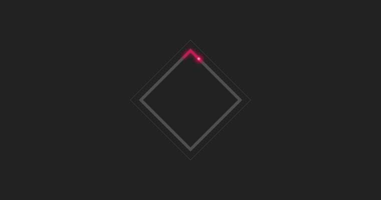
Next, we are going to add the 4 paths. Two for the light trail ( one to add a blur and the second to add some definition), one for the light and the other for the light radiant glow.
<svg x="0px" y="0px" viewBox="0 0 200 200" xml:space="preserve">
  <style>
    #bolt {
      stroke-dasharray: 45 515;
      stroke-dashoffset: 0;
    }
    #light {
      stroke-dasharray: 4 556;
      stroke-dashoffset: -42;
    }
    #radiant {
      stroke-dasharray: 10 550;
      stroke-dashoffset: -40;
    }
  </style>
  <filter id="blurLine">
      <feGaussianBlur in="SourceGraphic" stdDeviation="4" />
    </filter>
  <filter id="blurLight">
    <feGaussianBlur in="SourceGraphic" stdDeviation=".8" />
  </filter>
  <path d="M 15 15, 185 15, 185 185, 15 185 Z" fill="#222"/>
  <path d="M 30 30, 170 30, 170 170, 30 170 Z" fill="none" stroke-width="6px" stroke="rgba(255,255,255,.2)"/>
  <path id="bolt" d="M 30 30, 170 30, 170 170, 30 170 Z" fill="none" stroke-width="4px" stroke="#FF0054" filter="url(#blurLine)"/>
  <path id="bolt" d="M 30 30, 170 30, 170 170, 30 170 Z" fill="none" stroke-width="2px" stroke="#FF0054" />
  <path id="radiant" d="M 30 30, 170 30, 170 170, 30 170 Z" fill="none" stroke-width="10px" stroke="#FF0054" filter="url(#blurLine)"/>
  <path id="light" d="M 30 30, 170 30, 170 170, 30 170 Z" fill="none" stroke-width="4px" stroke="rgba(255,255,255,.8)" filter="url(#blurLight)"/>
</svg>
If you look at the code you will notice that I used style within the svg to target the ID's of the path. This works great if you save this as a .svg file later on. If you are using the SVG code inline I would recommend to ensure the ID's that you use are unique or use a class.
I also used the filter option within the svg. This is a great option for adding a simple gaussian blur. We won't get into it within this tutorial but there are many great things you can do with the svg filter element.
Breaking this done a little further you will notice the stroke-dasharray and stroke-dashoffset ... why did I use those numbers?
First you need to find the length of your stroke. To do this you can use same basic vanilla javascript
var myPath = document.getElementById("bolt");
var length = myPath.getTotalLength();
console.log("Result " + length);

//Result 560
Now that we have our length, the numbers might make a little more sense.
For the #bolt or light trail we use stroke-dasharray: 45 515;, this makes the stroke 45 in length and adds a space of 515
For the #light we use stroke-dasharray: 4 556; this makes the stroke 4 with a space of 556, but then we use offset so we can have it line up to the end of the light trail stroke-dashoffset: -42;. Similar with the radiant around the light.
Result

Animating our preloader
To animate the preloader we are going to use @keyframes
<svg x="0px" y="0px" viewBox="0 0 200 200" xml:space="preserve">
  <style>
    #bolt {
      stroke-dasharray: 45 515;
      stroke-dashoffset: 0;
      animation: bolt 3s linear infinite reverse;
    }
    @keyframes bolt {
      to {
        stroke-dashoffset: 560;
      }
    }
    #light {
      stroke-dasharray: 4 556;
      stroke-dashoffset: -42;
      animation: light 3s linear infinite reverse;
    }
    @keyframes light {
      to {
        stroke-dashoffset: 518;
      }
    }

    #radiant {
      stroke-dasharray: 10 550;
      stroke-dashoffset: -40;
      animation: radiant 3s linear infinite reverse;
    }
    @keyframes radiant {
      to {
        stroke-dashoffset: 520;
      }
    }
  </style>
  <filter id="blurLine">
      <feGaussianBlur in="SourceGraphic" stdDeviation="4" />
    </filter>
  <filter id="blurLight">
    <feGaussianBlur in="SourceGraphic" stdDeviation=".8" />
  </filter>
  <path d="M 15 15, 185 15, 185 185, 15 185 Z" fill="#222"/>
  <path d="M 30 30, 170 30, 170 170, 30 170 Z" fill="none" stroke-width="6px" stroke="rgba(255,255,255,.2)"/>
  <path id="bolt" d="M 30 30, 170 30, 170 170, 30 170 Z" fill="none" stroke-width="4px" stroke="#FF0054" filter="url(#blurLine)"/>
  <path id="bolt" d="M 30 30, 170 30, 170 170, 30 170 Z" fill="none" stroke-width="2px" stroke="#FF0054" />
  <path id="radiant" d="M 30 30, 170 30, 170 170, 30 170 Z" fill="none" stroke-width="10px" stroke="#FF0054" filter="url(#blurLine)"/>
  <path id="light" d="M 30 30, 170 30, 170 170, 30 170 Z" fill="none" stroke-width="4px" stroke="rgba(255,255,255,.8)" filter="url(#blurLight)"/>
</svg>
Using to inside the @keyframes is basically telling it to animate from 0% to 100%. The end result to make it go full circle is to make the stroke-dashoffset to equal our line length (560), minus the offset.
I also used linear so the animation is a consistent speed. infinite so that... well you guessed it... would be infinite, and lastly reverse so it would go in the direction I wanted it to go.
Result

Extra: to rotate it use transform.
I added this inside the style tag
path {
  transform: rotate(45deg) scale(.8);
  transform-origin: center;
}